> This page is for version 2024-10-01 (default).
> For other versions, use one of these documentation indexes:
> - 2024-10-01 (default): https://docs.getkard.com/2024-10-01/llms.txt
> - Legacy: https://docs.getkard.com/legacy/llms.txt
> For clean Markdown of any page, append .md to the page URL.
> For a complete documentation index, see https://docs.getkard.com/llms.txt.
> For AI client integration (Claude Code, Cursor, etc.), connect to the MCP server at https://docs.getkard.com/_mcp/server.
# Extended API Integration
Kard's Extended API feature enhances our existing rewards endpoints with dynamic, per-user offer data. By requesting UI components through the `supportedComponents` query parameter, you can surface richer offer experiences to your end users — dynamic descriptions, call-to-action buttons, contextual tags, progress bars, boosted rewards, and logo decorations — without building custom logic to interpret raw offer data.
This guide covers how to request and render extended offer fields from the [Get Offers by User](/2024-10-01/api/rewards/offers) and [Get Locations by User](/2024-10-01/api/rewards/locations) endpoints.
## Key Concepts
### Supported Components
The Extended API uses a **component-based model** to deliver dynamic offer data. You tell Kard which UI components your app supports, and the API returns the relevant data for each offer. Kard evaluates each offer independently and returns only the components that apply to that offer and that you requested.
| Component | Type | Description | Example Use Case |
| ------------------ | ---------- | --------------------------------------------------------------------------------------------- | ---------------------------------------------------------------------------------- |
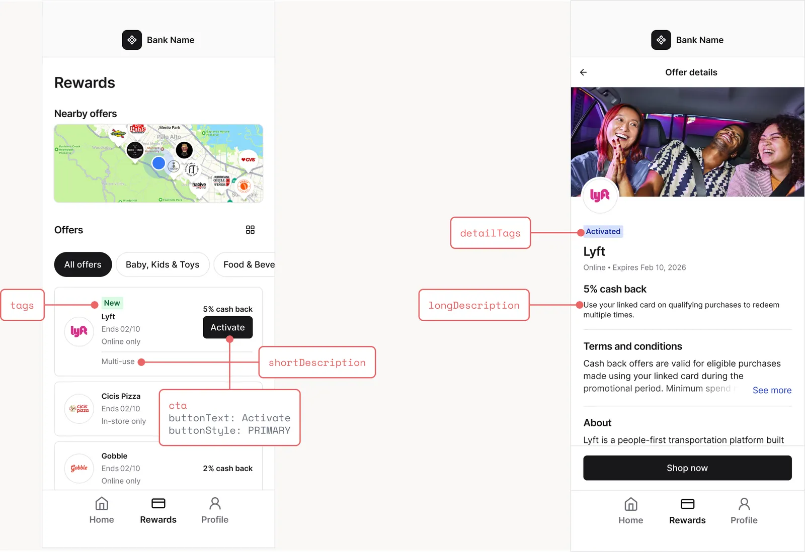
| `shortDescription` | `string` | A brief, dynamic description of the offer suitable for list/browse views | "Multi-use", "2 of 3 purchases" |
| `longDescription` | `string` | A detailed description suitable for offer detail pages | "Make a qualifying purchase to advance your progress bar toward your next reward." |
| `baseReward` | `string` | A formatted reward string ready for display | `"5% cash back"` |
| `boostedReward` | `string` | A formatted reward string for the elevated reward after a boost, shown alongside `baseReward` | `"10% cash back"` |
| `cta` | `object` | A call-to-action button with text, style, optional start icon, and an optional action URL | "Tap to activate", "Get 10%" |
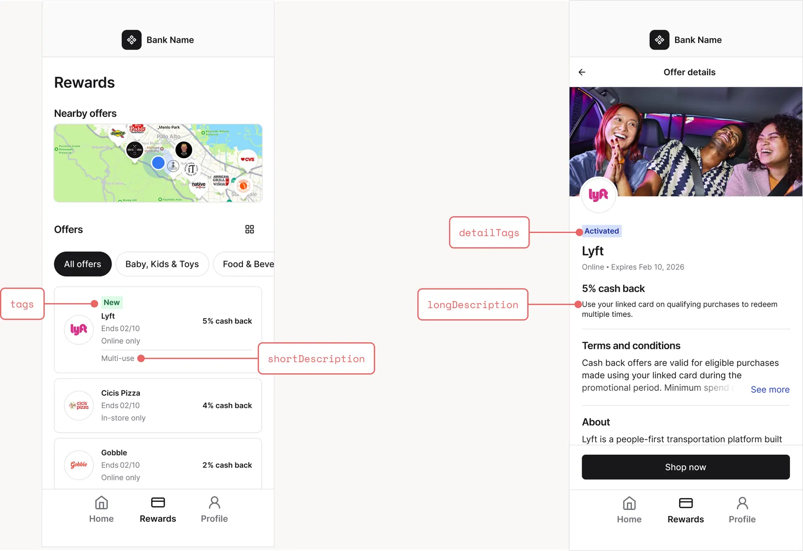
| `tags` | `string[]` | Contextual labels for the offer in list/browse views | `["New"]`, `["Limited supply"]` |
| `detailTags` | `string[]` | Contextual labels for the offer detail page | `["Activated"]`, `["Boosted 10%"]` |
| `logoFlare` | `object` | A colored border and optional badge to decorate the offer logo | Bolt badge on a boosted offer |
| `progressBar` | `object` | A data-driven progress bar for redemption counts, punch cards, and tiered/progressive rewards | "2 of 3" punch card, redemption tracker |
### How Components Are Returned
The components included in the response depend on what you request via the `supportedComponents` query parameter **and** on each offer's configuration.
**Support as many components as possible.** Kard renders each offer with the richest representation its state can take from the components you support, so the more you support, the more your users can see and act on. When an offer relies on a component you did *not* request — a `cta` to activate, a `progressBar` for a punch card, a `boostedReward` for a boost — Kard falls back to expressing that state through `shortDescription` and `longDescription`. If you don't support those either, the state is folded into the offer's `name` (for example, `"World's Greatest Chicken - tap to activate"`).
* **All components** (`shortDescription`, `longDescription`, `baseReward`, `boostedReward`, `cta`, `tags`, `detailTags`, `logoFlare`, `progressBar`): The full experience. Provides dynamic descriptions, formatted rewards, call-to-action buttons, contextual tags, logo decorations, and progress bars for both list and detail views. Best for apps that support interactive and visual elements.
* **Description-only components** (`shortDescription`, `longDescription`): Provides dynamic descriptions without interactive elements. Best for apps that cannot render buttons, tags, or progress bars. You must still give users an explicit way to activate offers by calling the [activate endpoint](/2024-10-01/api/attributions/activate) (see [Step 4b](#step-4b-handle-activation-and-boosts-description-only)), then display the updated descriptions reflecting the new user state.
> **Warning**
>
> **VIEW events do not activate or boost offers.** Every integration must explicitly call the [activate endpoint](/2024-10-01/api/attributions/activate) to activate an offer, or the [boost endpoint](/2024-10-01/api/attributions/boost) to boost an offer, for a user. Firing a VIEW attribution event does not count as activation or boosting.
> **Warning**
>
> **At minimum, support `shortDescription` and `longDescription`.** They are the universal fallback for offer state: when an offer requires a richer component your app doesn't support (for example a `cta` or a `progressBar`), its state is expressed through these descriptions instead. Without them, that state is only available in a modified offer `name` — and your users may miss required actions like activating or boosting an offer.
Which components an offer surfaces depends on its configuration. For example:
* A **standard activatable offer** surfaces a `cta` (and `tags`/`detailTags`) until it is activated.
* A **boostable offer** surfaces a boost `cta` before boosting, then a `boostedReward` (with `baseReward` struck through) and a `logoFlare` decoration after boosting.
* A **multi-redemption**, **punch-card**, or **progressive-reward** offer surfaces a `progressBar` (plus a matching `shortDescription`).
* A **limited-supply** offer surfaces a `"Limited supply"` tag and remaining-redemption copy in its descriptions.
> **Note**
>
> You can request any combination of components. Kard evaluates each offer independently and returns only the components that apply to that offer. If a component does not apply, it is simply omitted — always check for presence before rendering.
## Implementation
### Step 1: Add the `supportedComponents` Query Parameter
Append the `supportedComponents` query parameter to your existing Get Offers by User or Get Locations by User requests. Use repeated parameters for multiple component types.
**Get Offers by User with all components:**
```
GET /v2/issuers/{{organizationId}}/users/{{userId}}/offers?supportedComponents=shortDescription&supportedComponents=longDescription&supportedComponents=baseReward&supportedComponents=boostedReward&supportedComponents=cta&supportedComponents=tags&supportedComponents=detailTags&supportedComponents=logoFlare&supportedComponents=progressBar
```
**Get Locations by User with all components:**
```
GET /v2/issuers/{{organizationId}}/users/{{userId}}/locations?include=offers&supportedComponents=shortDescription&supportedComponents=longDescription&supportedComponents=baseReward&supportedComponents=boostedReward&supportedComponents=cta&supportedComponents=tags&supportedComponents=detailTags&supportedComponents=logoFlare&supportedComponents=progressBar
```
**Get Offers by User with description-only components:**
```
GET /v2/issuers/{{organizationId}}/users/{{userId}}/offers?supportedComponents=shortDescription&supportedComponents=longDescription
```
> **Warning**
>
> For Get Locations by User, you **must** include `include=offers` in the query to receive offer data with components.
> **Note**
>
> `supportedComponents` accepts only the values listed in the [Supported Components](#supported-components) table. Requesting an unknown value returns a `400 Invalid Request`.
### Step 2: Parse the `components` Object
When `supportedComponents` is provided and an offer is eligible for extended data, the response includes a `components` object within the offer `attributes`.
**Example Response with all components (activatable offer, not yet activated):**
```json
{
"data": [
{
"type": "standardOffer",
"id": "5e27318c9b346f00087fbb5c",
"attributes": {
"name": "Worlds Greatest Chicken",
"userReward": {
"type": "PERCENT",
"value": 5.7
},
"purchaseChannel": ["INSTORE"],
"startDate": "2024-11-17T05:00:00Z",
"expirationDate": "2025-03-17T05:00:00Z",
"terms": "Worlds Greatest Chicken offers are only available within US Locations.",
"isTargeted": true,
"assets": [
{
"url": "https://attribution.getkard.com/logos/wgc_logo.png?token=example",
"alt": "",
"type": "IMG_VIEW"
}
],
"components": {
"shortDescription": "Multi-use",
"longDescription": "Use your linked card on qualifying purchases to redeem multiple times.",
"baseReward": "5.7% cash back",
"cta": {
"buttonText": "Activate",
"buttonStyle": "PRIMARY",
"action": {
"url": "/v2/issuers/{{organizationId}}/users/{{userId}}/offers/5e27318c9b346f00087fbb5c/activate?include=offer&supportedComponents=cta&supportedComponents=tags&supportedComponents=detailTags",
"method": "POST"
}
},
"tags": [],
"detailTags": ["Activated"]
}
},
"relationships": {
"category": {
"data": [
{ "type": "category", "id": "65920081b524d126068de24a" }
]
}
}
}
],
"links": {
"self": "/v2/issuers/{{organizationId}}/users/{{userId}}/offers?supportedComponents=cta&supportedComponents=tags&supportedComponents=detailTags",
"prev": null,
"next": null
},
"included": [
{
"type": "category",
"id": "65920081b524d126068de24a",
"attributes": { "name": "Food & Beverage" }
}
]
}
```
**Example `components` for a boostable offer (after the user has boosted it):**
```json
"components": {
"shortDescription": "Boosted 10%",
"longDescription": "Boosted 10%. Earn 10% cash back at Worlds Greatest Chicken with your eligible card.",
"baseReward": "5% cash back",
"boostedReward": "10% cash back",
"tags": [],
"detailTags": ["Boosted 10%"],
"logoFlare": {
"borderColor": "PRIMARY",
"badge": {
"icon": "",
"position": "TOP_RIGHT"
}
}
}
```
Before the offer is boosted, the same offer instead returns a boost `cta` (a `SECONDARY` button such as "Get 10%") and no `boostedReward`/`logoFlare`. See [Handle Call-To-Action Events](#step-4a-handle-call-to-action-events).
**Example `components` for a punch-card offer (rewards every 3rd purchase; user is 2 of 3):**
```json
"components": {
"shortDescription": "Make 3 purchases to earn",
"progressBar": {
"total": 3,
"currentProgress": 2,
"labels": {
"default": { "left": "", "right": "2 of 3" }
},
"segments": {
"default": { "position": "LEFT", "selection": "CURRENT_AND_BELOW" },
"progress": [
{ "completed": 1, "total": 1 },
{ "completed": 1, "total": 1 },
{ "completed": 0, "total": 1 }
]
}
}
}
```
See [Rendering the Progress Bar](#rendering-the-progress-bar) for the full model and more examples.
### Step 3: Render Components in Your UI
How you render the components depends on which ones you requested and which the offer returns. Always check for presence before rendering — an offer that isn't eligible for a component simply omits it.
**Descriptions and rewards**
1. Display `shortDescription` on offer cards in list/browse views.
2. Display `longDescription` on the offer detail page.
3. Display `baseReward` as the formatted reward amount (e.g., "5.7% cash back").
4. If `boostedReward` is present, render it as the **active** reward and show `baseReward` with a **strikethrough** to communicate the uplift (e.g., ~~5% cash back~~ **10% cash back**).
**Call-to-action button (`cta`)**
5. If `cta` is present, display the call-to-action button using `buttonText`:
* Style the button per `buttonStyle`: `PRIMARY` (prominent, e.g. activation), `SECONDARY` (lower-emphasis, e.g. boost), or `DISABLED` (rendered but not interactive).
* If `startIcon` is present, render it (an inline SVG string) before the button text.
* When tapped, call the URL in `cta.action.url` using `cta.action.method` (see [Step 4a](#step-4a-handle-call-to-action-events)).
6. If `cta` is absent, the offer requires no action right now (e.g. it has already been activated) — hide the button.
**Tags**
7. Render `tags` as overlays or badges on the offer card in list/browse views (may be empty).
8. Render `detailTags` as labels on the offer detail page.
**Logo flare (`logoFlare`)**
9. If `logoFlare` is present, decorate the offer's logo/thumbnail:
* Draw a border around the logo using `borderColor` (`PRIMARY` or `SECONDARY`, mapped to your theme colors).
* If `badge` is present, overlay the `badge.icon` (an inline SVG) at the corner given by `badge.position`.
**Progress bar (`progressBar`)**
10. If `progressBar` is present, render it per [Rendering the Progress Bar](#rendering-the-progress-bar). Use the compact `default` layout on cards and the richer `details` layout on the offer detail page.
**All components, offer not activated:**
**All components, offer is activated:**
**If you requested description-only components (`shortDescription` and `longDescription`):**
This approach is for issuers that cannot render Kard's call-to-action component or graphical elements. Progress and state are still communicated through the descriptions (e.g. `shortDescription` reads "2 of 3 purchases" for a punch-card offer).
1. Display `shortDescription` on offer cards in list/browse views.
2. Display `longDescription` on the offer detail page.
3. Provide your own explicit activation and boost actions. When the user takes one, call the [**activate endpoint**](/2024-10-01/api/attributions/activate) or [**boost endpoint**](/2024-10-01/api/attributions/boost) (see [Step 4b](#step-4b-handle-activation-and-boosts-description-only)).
4. Re-render the offer with the updated `shortDescription` and `longDescription` from the response.
> **Warning**
>
> **Important:** Activation must be an explicit call to the [activate endpoint](/2024-10-01/api/attributions/activate), and boosting must be an explicit call to the [boost endpoint](/2024-10-01/api/attributions/boost). Viewing an offer, or firing a VIEW attribution event, does not activate or boost it.
### Step 4a: Handle Call-To-Action Events
When a user taps a call-to-action button, call the endpoint provided in `cta.action` using the given `method`. **Use `cta.action.url` and `cta.action.method` exactly as provided** — the path, query string, and method are pre-configured by Kard. Different offers point at different actions:
* **Activation** offers point at the [activate endpoint](/2024-10-01/api/attributions/activate):
```
POST /v2/issuers/{{organizationId}}/users/{{userId}}/offers/{{offerId}}/activate
```
* **Boost** offers point at the [boost endpoint](/2024-10-01/api/attributions/boost):
```
POST /v2/issuers/{{organizationId}}/users/{{userId}}/offers/{{offerId}}/boost
```
The `cta.action.url` Kard returns already includes `include=offer` and your requested `supportedComponents`, so the response contains the updated offer:
```
POST /v2/issuers/{{organizationId}}/users/{{userId}}/offers/{{offerId}}/activate?include=offer&supportedComponents=shortDescription&supportedComponents=longDescription&supportedComponents=cta&supportedComponents=tags&supportedComponents=detailTags
```
**Activation response (201 Created):**
```json
{
"data": {
"type": "offerAttribution",
"id": "attribution-event-id",
"attributes": {
"entityId": "5e27318c9b346f00087fbb5c",
"eventCode": "ACTIVATE",
"medium": "CTA",
"eventDate": "2025-01-07T16:30:00Z"
}
},
"included": [
{
"type": "standardOffer",
"id": "5e27318c9b346f00087fbb5c",
"attributes": {
"name": "Worlds Greatest Chicken",
"userReward": { "type": "PERCENT", "value": 5.7 },
"components": {
"shortDescription": "Multi-use",
"longDescription": "Use your linked card on qualifying purchases to redeem multiple times.",
"tags": [],
"detailTags": ["Activated"],
"baseReward": "5.7% cash back"
}
}
}
]
}
```
**Boost response (201 Created):** identical in shape, but `eventCode` is `BOOST`. The included offer now carries the elevated `boostedReward`, the struck-through `baseReward`, and a `logoFlare`:
```json
{
"data": {
"type": "offerAttribution",
"id": "attribution-event-id",
"attributes": {
"entityId": "5e27318c9b346f00087fbb5c",
"eventCode": "BOOST",
"medium": "CTA",
"eventDate": "2025-01-07T16:30:00Z"
}
},
"included": [
{
"type": "standardOffer",
"id": "5e27318c9b346f00087fbb5c",
"attributes": {
"name": "Worlds Greatest Chicken",
"components": {
"baseReward": "5% cash back",
"boostedReward": "10% cash back",
"tags": [],
"detailTags": ["Boosted 10%"],
"logoFlare": {
"borderColor": "PRIMARY",
"badge": {
"icon": "",
"position": "TOP_RIGHT"
}
}
}
}
}
]
}
```
Use the updated offer from `included` to immediately refresh your UI without re-fetching the full offer list. After a successful action the offer's components change (for example, an activation drops the `cta` and sets `detailTags` to `["Activated"]`; a boost drops the boost `cta` and adds `boostedReward` + `logoFlare`).
### Step 4b: Handle Activation and Boosts (Description-Only)
If you are only using `shortDescription` and `longDescription` (no `cta`), you must still activate and boost offers explicitly.
**Activation**
When the user takes your activation action, call the [activate endpoint](/2024-10-01/api/attributions/activate) with `include=offer` and your supported components:
```
POST /v2/issuers/{{organizationId}}/users/{{userId}}/offers/{{offerId}}/activate?include=offer&supportedComponents=shortDescription&supportedComponents=longDescription
```
The updated offer in the response `included` array has descriptions that reflect the new user state:
```json
"components": {
"shortDescription": "Activated",
"longDescription": "Activated. Earn 5% cash back at Worlds Greatest Chicken with your eligible card."
}
```
Before activation, `shortDescription` reads `"Tap to activate"` — use it to tell users the offer needs activation.
**Boosts**
When the user takes your boost action, call the [boost endpoint](/2024-10-01/api/attributions/boost) with `include=offer` and your supported components:
```
POST /v2/issuers/{{organizationId}}/users/{{userId}}/offers/{{offerId}}/boost?include=offer&supportedComponents=shortDescription&supportedComponents=longDescription
```
The updated offer in the response `included` array has descriptions that reflect the boosted reward:
```json
"components": {
"shortDescription": "Boosted 10%",
"longDescription": "Boosted 10%. Earn 10% cash back at Worlds Greatest Chicken with your eligible card."
}
```
Before boosting, `shortDescription` reads `"Tap for 10%"` (or `"Tap to boost"` when no boosted reward amount is available) — use it to tell users the offer can be boosted.
After either action, re-render the offer detail page with the updated `longDescription`, and update the offer card with the new `shortDescription` in your list views.
> **Note**
>
> **We recommend integrating with call-to-action components when possible.** The `cta` component tells you exactly when an offer needs activation or boosting and which endpoint to call, so you don't need to build that logic yourself.
## Rendering the Progress Bar
The `progressBar` component tracks a user's progress toward a reward. It powers three offer types with a single, fully data-driven model — you do not need to know the offer type to render it correctly:
* **Redemption count** — a multi-use offer, tracking how many of `N` redemptions the user has used.
* **Punch card** — an offer that rewards every `N` qualifying purchases, tracking progress toward the next reward.
* **Progressive / tiered rewards** — an offer whose reward grows as the user climbs tiers.
### Anatomy
```json
"progressBar": {
"total": 3,
"currentProgress": 1,
"labels": {
"default": { "left": "", "right": "2 of 3" },
"details": { "left": "Redemptions", "right": "" }
},
"segments": {
"default": { "position": "LEFT", "selection": "CURRENT_AND_BELOW", "icon": "", "separator": "LINE", "labels": [ { "title": "5%", "description": "" } ] },
"details": { "position": "RIGHT", "selection": "CURRENT" },
"progress": [
{ "completed": 1, "total": 1 },
{ "completed": 0, "total": 1 },
{ "completed": 0, "total": 1 }
]
}
}
```
* **`total`** — the number of nodes/steps in the bar.
* **`currentProgress`** — how far the user has progressed (clamp to `0..total` when rendering).
* **`labels`** — the left/right text that flanks the bar, per layout (see below).
* **`segments`** — how to draw the bar, per layout, plus the per-node `progress` fill array. Absent for a plain continuous bar.
### Pick the layout for your surface
A single `progressBar` payload carries **two layouts** so you can render the same data differently on a card versus a detail page:
* **`default`** — the compact layout for list/browse/card views. Use `labels.default` and `segments.default`.
* **`details`** — the richer layout for the offer detail page. Use `labels.details` and `segments.details`, each **falling back to `default`** when not present.
### Choose the visual style
The resolved segment configuration (`segments.default` or `segments.details`) determines the visual style:
1. **Continuous bar** — when `segments` is absent. Draw a single bar filled to `currentProgress / total`, flanked by the left/right labels. (Used for redemption-count offers with more than 5 redemptions.)
2. **Segmented bars** — when `segments` is present with **no** `separator`. Draw one bar per node (`total` nodes). Fill each node `i` to `progress[i].completed / progress[i].total`. Nodes support **partial fill** (e.g. `2 / 4`), which a punch card uses to show progress within the current step. If a segment provides per-node `labels`, render each label next to its bar.
3. **Icon tiers with line separators** — when `segments..separator` is `LINE` and `position` is `FULL_WIDTH`. Draw the `icon` (an inline SVG) for each node, connected by horizontal lines, with the per-node `labels[i].title` beneath. Icons are **binary** (active/inactive) and ignore partial fill. (Used for progressive/tiered rewards.)
### Fill and selection rules
* **Per-node fill** comes from `segments.progress[i]` (`completed / total`). When `progress` is absent, a node is either full or empty based on selection.
* **`selection`** decides which nodes read as "reached":
* `CURRENT` — nodes with index `< currentProgress`.
* `CURRENT_AND_BELOW` — nodes with index `<= currentProgress`.
* **`icon`** SVGs are themeable via the CSS custom properties `--icon-fill`, `--icon-outline`, and `--icon-detail`. Set these on the icon's container to match your theme's active/inactive colors; icons that don't reference the variables fall back to their embedded colors.
* **`position`** places the segments relative to the labels: `LEFT`, `RIGHT`, or `FULL_WIDTH` (segments span the full width with labels above).
### Example: redemption-count bar
A multi-use offer redeemable up to 3 times, where the user has redeemed 1. Five or fewer redemptions render as segmented nodes with a check icon; more than five render as a continuous bar.
```json
"shortDescription": "Use up to 3 times",
"progressBar": {
"total": 3,
"currentProgress": 1,
"labels": {
"default": { "left": "", "right": "" },
"details": { "left": "Redemptions", "right": "" }
},
"segments": {
"default": { "icon": "", "position": "LEFT", "selection": "CURRENT" },
"details": { "icon": "", "position": "RIGHT", "selection": "CURRENT" },
"progress": [
{ "completed": 1, "total": 1 },
{ "completed": 0, "total": 1 },
{ "completed": 0, "total": 1 }
]
}
}
```
Renders as three check icons, the first filled. On the detail page a "Redemptions" label sits to the left.

### Example: punch card
An offer that rewards every 3rd qualifying purchase, with the user 2 of 3 into the current card:
```json
"shortDescription": "Make 3 purchases to earn",
"progressBar": {
"total": 3,
"currentProgress": 2,
"labels": {
"default": { "left": "", "right": "2 of 3" }
},
"segments": {
"default": { "position": "LEFT", "selection": "CURRENT_AND_BELOW" },
"progress": [
{ "completed": 1, "total": 1 },
{ "completed": 1, "total": 1 },
{ "completed": 0, "total": 1 }
]
}
}
```
Renders as three bars, the first two filled and the third empty, with a "2 of 3" label to the right. Once the user redeems every reward the offer allows, every node reads full and the copy switches to a "reward redeemed" message.

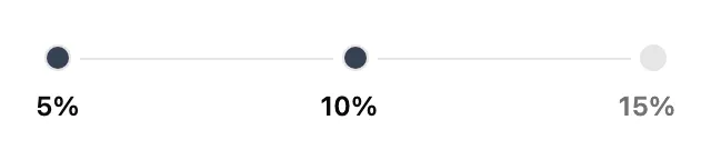
### Example: progressive / tiered rewards
An offer with three reward tiers (5%, 10%, 15%) where the user has reached the first tier:
```json
"shortDescription": "Earn more with each purchase",
"baseReward": "10% cash back",
"progressBar": {
"total": 3,
"currentProgress": 1,
"labels": { "default": { "left": "", "right": "" } },
"segments": {
"default": {
"position": "FULL_WIDTH",
"separator": "LINE",
"icon": "",
"labels": [
{ "title": "5%", "description": "" },
{ "title": "10%", "description": "" },
{ "title": "15%", "description": "" }
],
"selection": "CURRENT_AND_BELOW"
},
"progress": [
{ "completed": 1, "total": 1 },
{ "completed": 0, "total": 1 },
{ "completed": 0, "total": 1 }
]
}
}
```
Renders as three ring icons joined by lines with "5%", "10%", "15%" beneath — the reached tiers highlighted. When a progressive offer is also a punch card, Kard omits the icon/separator so the raw segmented bars can show partial fill toward the next tier.
### Rendering algorithm
1. Pick the layout: `details` on the detail page, otherwise `default`.
2. Resolve `labels = labels[layout] ?? labels.default` and `segment = segments[layout] ?? segments.default`.
3. If there is no `segments` object, draw a **continuous** bar filled to `currentProgress / total` between the left/right labels. Done.
4. Otherwise, for each node `i` in `0..total-1`, compute its fill: `progress[i].completed / progress[i].total` if provided, else full/empty per `selection`.
5. If `segment.separator` is `LINE` (and `position` is `FULL_WIDTH`), draw `icon`s joined by lines with `labels[i].title` beneath (icons are binary). Otherwise draw one bar per node, applying each node's fractional fill and any per-node label.
6. Place the label block according to `position` (`LEFT`, `RIGHT`, or `FULL_WIDTH`).
> **Note**
>
> **Progress is display-only and dynamic.** Progress bar values reflect the user's current state at request time and change as the user transacts. Do not cache them across sessions; re-fetch to get the latest state.
## Component Reference
### `components` Object
| Field | Type | Description |
| ------------------ | --------------------- | ------------------------------------------------------------------------------------------------------------------ |
| `shortDescription` | `string` (optional) | Brief dynamic description for list/browse views |
| `longDescription` | `string` (optional) | Detailed dynamic description for offer detail pages |
| `baseReward` | `string` (optional) | Formatted reward string for display (e.g. "5.7% cash back" or "\$2.00 cash back") |
| `boostedReward` | `string` (optional) | Formatted elevated reward string shown after a boost; render as the active reward with `baseReward` struck through |
| `cta` | `object` (optional) | Call-to-action button configuration |
| `tags` | `string[]` (optional) | Contextual labels for list/browse views |
| `detailTags` | `string[]` (optional) | Contextual labels for offer detail pages |
| `logoFlare` | `object` (optional) | Logo border + badge decoration |
| `progressBar` | `object` (optional) | Progress bar for redemption counts, punch cards, and tiered rewards |
### `cta` Object
| Field | Type | Description |
| --------------- | ------------------- | --------------------------------------------------------------------------------------------------------------------------------------------------------------------------------------------------------------------- |
| `buttonText` | `string` | Text to display on the button (e.g., "Activate", "Get 10%") |
| `buttonStyle` | `enum` | `PRIMARY` (prominent, e.g. activate), `SECONDARY` (lower-emphasis, e.g. boost), or `DISABLED` (rendered but non-interactive). The `cta` is omitted entirely once the action has been taken (e.g. an activated offer). |
| `startIcon` | `string` (optional) | Inline SVG string to render before the button text |
| `action` | `object` (optional) | Contains the URL and method to call when the button is tapped |
| `action.url` | `string` | API endpoint to call when the button is tapped (already includes `include=offer` and your `supportedComponents`) |
| `action.method` | `string` | HTTP method to use (e.g., `POST`) |
### `logoFlare` Object
| Field | Type | Description |
| ---------------- | ------------------- | --------------------------------------------------------------------------------- |
| `borderColor` | `enum` | Border color around the logo: `PRIMARY` or `SECONDARY` (map to your theme colors) |
| `badge` | `object` (optional) | Corner badge overlay |
| `badge.icon` | `string` | Inline SVG string for the badge icon |
| `badge.position` | `enum` | `TOP_RIGHT`, `TOP_LEFT`, `BOTTOM_RIGHT`, or `BOTTOM_LEFT` |
### `progressBar` Object
| Field | Type | Description |
| ----------------- | ---------------------- | ------------------------------------------------------------------------------------------------------- |
| `total` | `integer` | Number of nodes/steps in the bar |
| `currentProgress` | `integer` | How far the user has progressed (clamp to `0..total`) |
| `labels` | `object` | Left/right labels per layout (`default`, `details`) |
| `segments` | `object` (optional) | Segment configuration per layout, plus the per-node `progress` fill array. Absent for a continuous bar. |
| `label` | `string` (deprecated) | Legacy single label. Use `labels` instead. |
| `segmented` | `boolean` (deprecated) | Legacy flag. Rely on the presence of `segments` instead. |
#### `progressBar.labels`
| Field | Type | Description |
| -------------------------------- | ------------------- | --------------------------------------------------------------- |
| `default` | `object` | Label pair for the default (card) layout |
| `details` | `object` (optional) | Label pair for the detail-page layout (falls back to `default`) |
| `default.left` / `default.right` | `string` (optional) | Text for the left/right label |
#### `progressBar.segments`
| Field | Type | Description |
| ---------- | ------------------- | -------------------------------------------------------------------------- |
| `default` | `object` | Segment configuration for the default (card) layout |
| `details` | `object` (optional) | Segment configuration for the detail-page layout (falls back to `default`) |
| `progress` | `object[]` | Per-node fill state, index-aligned with the nodes (length equals `total`) |
#### `progressBar.segments.default` / `.details` (segment configuration)
| Field | Type | Description |
| ----------- | --------------------- | ---------------------------------------------------------------------------------------------------------------------- |
| `position` | `enum` | `LEFT`, `RIGHT`, or `FULL_WIDTH` — placement of the segments relative to labels |
| `selection` | `enum` (optional) | Which nodes read as reached: `CURRENT` (index `< currentProgress`) or `CURRENT_AND_BELOW` (index `<= currentProgress`) |
| `separator` | `enum` (optional) | `LINE` renders icon nodes joined by horizontal lines (requires `position: FULL_WIDTH`) |
| `icon` | `string` (optional) | Inline SVG for each node; themeable via `--icon-fill`, `--icon-outline`, `--icon-detail` |
| `labels` | `object[]` (optional) | Per-node labels (`title`, `description`) |
#### `progressBar.segments.progress[]`
| Field | Type | Description |
| ----------- | --------- | -------------------------------------------------------------------------- |
| `completed` | `integer` | Units completed within this node |
| `total` | `integer` | Units required to complete this node (a node fills to `completed / total`) |
## Important Notes
> **Note**
>
> **Component availability is per-offer.** Different offers in the same response may return different components depending on their configuration.
> **Note**
>
> **The `components` object is additive.** Existing fields like `name`, `userReward`, `terms`, and `assets` are always returned regardless of whether you request components.
> **Note**
>
> **Component values are dynamic.** Descriptions, tags, CTA state, boosted rewards, and progress bars reflect the user's state at request time and can change between requests. Re-fetch to get the latest state; do not cache component data across sessions.
## Best Practices
* **Support as many components as possible.** Different offers rely on different components (activation, boosts, punch cards, tiered rewards, limited supply). The more you support, the more offers render fully; unsupported features degrade to `shortDescription`/`longDescription`, and then to a modified offer `name`.
* **At minimum, support `shortDescription` and `longDescription`.** They are the universal fallback for any offer state you don't otherwise support — without them, that state is only available in the offer `name` and users may miss required actions.
* **Always check for the presence of a component before rendering.** Not every offer includes every component — your UI should gracefully fall back to standard offer fields.
* **Use `cta.action` exactly as provided.** The URL (including its query string) and method are pre-configured by Kard. Do not modify them.
* **Render state changes immediately.** After a successful `cta` action, use the updated offer from the response `included` array to update your UI without waiting for a full list refresh.
* **Choose components based on your UI capabilities.** If you cannot render interactive buttons or graphical elements, request `shortDescription` and `longDescription` — progress and state are still conveyed through the descriptions. You must still call the [activate endpoint](/2024-10-01/api/attributions/activate) and [boost endpoint](/2024-10-01/api/attributions/boost) explicitly to activate and boost offers.
* **Never rely on VIEW events for activation or boosting.** Viewing an offer does not activate or boost it; only an explicit call to the [activate endpoint](/2024-10-01/api/attributions/activate) or [boost endpoint](/2024-10-01/api/attributions/boost) does.
* **Request only the components you support.** Avoid requesting components you don't intend to render.
* **Show the reward uplift for boosts.** When `boostedReward` is present, render it as the active reward and strike through `baseReward` so the uplift is clear.
* **Render the progress bar per surface.** Use the `default` layout on cards and the `details` layout on the offer detail page, and honor per-node `progress` fill so punch cards show partial progress.
* **Handle the absence of `cta` after an action.** When an offer has been activated or boosted, the `cta` is omitted. Hide the button when `cta` is absent.
* **Do not cache component data across sessions.** Values like tags, CTA state, boosted rewards, and progress are dynamic and may change between requests.